
Introduction
There’s something magical about swiping. It feels natural. Smooth. Personal.
In Gmail, you swipe to archive or delete emails with satisfying motion and color. And now, you’ll learn to recreate that same interaction for your to-do app—step by step—using vanilla JavaScript and CSS only.
Let’s make your app feel alive.
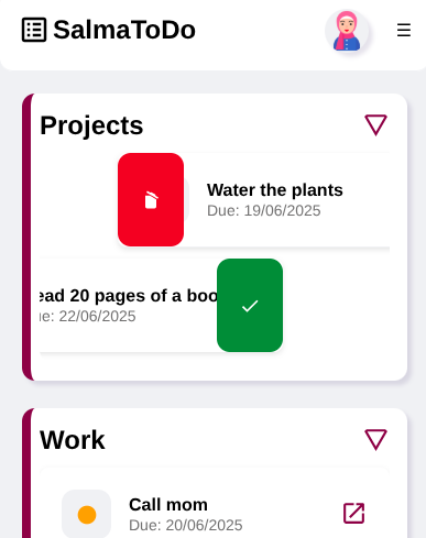
What Are We Building?
We’re going to build:
- Swipeable items (left or right)
- A delete action with a red background
- A check/done action with a green background
- Mobile + desktop support
- A reusable class you can drop into any project
No libraries. Just clean HTML, CSS, and JavaScript.
Step 1: Basic Styles for Swipeable Items
Let’s start with the visual foundation. Add this to your SwipeHandler.css file or inside <style> in your page:
.swipe-item {
  position: relative;
  background: #fff;
  padding: 20px;
  margin: 10px 0;
  border-radius: 8px;
  overflow: hidden;
  box-shadow: 0 2px 5px rgba(0, 0, 0, 0.1);
  transition: transform 0.3s ease;
}
This styles each swipeable item with padding, shadow, and a subtle animation for smooth swipes.
Now let’s define the backgrounds that appear when swiping.
.swipe-bg {
  position: absolute;
  top: 0;
  bottom: 0;
  width: 60px;
  display: flex;
  align-items: center;
  padding: 0 20px;
  z-index: 0;
  opacity: 0;
  visibility: hidden;
  transition: opacity 0.2s ease;
  color: white;
  font-size: 24px;
}
This part defines the hidden color blocks (with icons) that will appear when swiping.
.swipe-bg.visible {
  opacity: 1;
  visibility: visible;
}
Makes the background visible when swiping.
.bg-right {
  background-color: #d93025; /* Gmail red */
  justify-content: flex-start;
  left: 0;
}

.bg-left {
  background-color: #188038; /* Gmail green */
  justify-content: flex-end;
  right: 0;
}
🟥 Red background (delete) shows on the right, and 🟩 green background (done) shows on the left.
Step 2: The JavaScript Class — SwipeHandler
Now let’s create our swipe system in JavaScript. Create a file SwipeHandler.js and paste the code in chunks.
Step 2.1 – Setup and Constructor
export class SwipeHandler {
  constructor(element, config) {
    this.el = element;
    this.onSwipeLeft = config.onSwipeLeft || (() => {});
    this.onSwipeRight = config.onSwipeRight || (() => {});
    this.threshold = config.threshold || 100;

    this._addIndicators();
    this._initSwipeListeners();
  }
xplanation:
We create a class that accepts:
- an element (
.swipe-item) - config for actions on left/right swipe
- a swipe threshold
Then we set up indicators and listeners.
Step 2.2 – Add Left/Right Icons
  _addIndicators() {
    this.leftBg = document.createElement("div");
    this.leftBg.className = "swipe-bg bg-left";
    this.leftBg.innerHTML = `<svg style="fill: white;" viewBox="0 0 24 24"><path d="M21,7L9,19L3.5,13.5L4.91,12.09L9,16.17L19.59,5.59L21,7Z" /></svg>`;
    this.el.appendChild(this.leftBg);

    this.rightBg = document.createElement("div");
    this.rightBg.className = "swipe-bg bg-right";
    this.rightBg.innerHTML = `<svg style="fill:white;" viewBox="0 0 24 24"><path d="M20.37,8.91L19.37,10.64L7.24,3.64L8.24,1.91L11.28,3.66L12.64,3.29L16.97,5.79L17.34,7.16L20.37,8.91M6,19V7H11.07L18,11V19A2,2 0 0,1 16,21H8A2,2 0 0,1 6,19Z" /></svg>`;
    this.el.appendChild(this.rightBg);
  }
We dynamically insert background elements with SVG icons (check & delete).
Step 2.3 – Swipe Detection
  _initSwipeListeners() {
    let startX = 0, currentX = 0, swiping = false;

    const handleStart = (e) => {
      swiping = true;
      startX = e.touches ? e.touches[0].clientX : e.clientX;
      currentX = startX;
      this.el.style.transition = "none";
      this._hideBoth();
    };
Starts the swipe, records the initial X position.
    const handleMove = (e) => {
      if (!swiping) return;
      currentX = e.touches ? e.touches[0].clientX : e.clientX;
      const diffX = currentX - startX;
      this.el.style.transform = `translateX(${diffX}px)`;

      if (diffX > 10) {
        this._showRight();
      } else if (diffX < -10) {
        this._showLeft();
      } else {
        this._hideBoth();
      }
    };
This handles the dragging motion and shows/hides background actions.
    const handleEnd = () => {
      swiping = false;

      const diffX = currentX - startX;
      this.el.style.transition = "transform 0.3s ease";
      this._hideBoth();

      if (diffX > this.threshold) {
        this._handleSwipeRight();
      } else if (diffX < -this.threshold) {
        this._handleSwipeLeft();
      } else {
        this.el.style.transform = "translateX(0)";
      }
    };
    this.el.addEventListener("touchstart", handleStart);
    this.el.addEventListener("touchmove", handleMove);
    this.el.addEventListener("touchend", handleEnd);
    this.el.addEventListener("mousedown", handleStart);
    this.el.addEventListener("mousemove", handleMove);
    this.el.addEventListener("mouseup", handleEnd);
On release, this part decides what to do: reset, delete, or mark as done.
Step 2.4 – Swipe Logic
  _handleSwipeRight() {
    this.el.style.transform = "translateX(100%)";
    this.onSwipeRight(this.el);
  }

  _handleSwipeLeft() {
    this.el.style.transform = "translateX(0)";
    this.onSwipeLeft(this.el);
  }
Custom actions are called based on swipe direction.
Step 2.5 – Visibility Control
  _hideBoth() {
    this.leftBg.classList.remove("visible");
    this.rightBg.classList.remove("visible");
  }

  _showLeft() {
    this.leftBg.classList.add("visible");
    this.rightBg.classList.remove("visible");
  }

  _showRight() {
    this.rightBg.classList.add("visible");
    this.leftBg.classList.remove("visible");
  }
}
Shows/hides backgrounds and icons based on swipe direction.
Step 3: Attach to Your To-Do Items
Assume you have this HTML structure:
<li class="swipe-item" id="todo-1">Buy groceries</li>
<li class="swipe-item" id="todo-2">Finish Techlino post</li>
And this JavaScript:
document.querySelectorAll(".swipe-item").forEach((item) => {
  new SwipeHandler(item, {
    onSwipeLeft: () => {
      const id = item.getAttribute('id');
      handleDoneTodo(id); // Your logic here
    },
    onSwipeRight: () => {
      const id = item.getAttribute('id');
      handleDeleteTodo(id); // Your logic here
    }
  });
});
Recap
- We created swipeable items with smooth motion
- Added action backgrounds and icons
- Hooked into custom logic (delete/done)
- No libraries, works on mobile and desktop
What’s Next?
This class is reusable and extendable. What would you like to build with it?
- Swipeable product cards?
- Swipe-to-dismiss alerts?
- Even swipe-based navigation?
Tell me your idea in the comments below 👇
I’ll help you build it or write the next guide around it.
Mohammad Dahamshi is a skilled Embedded Software Engineer and web developer. With experience in C/C++, Linux, WordPress, and DevOps tools, he helps businesses solve technical challenges and build reliable digital solutions. Fluent in Arabic, Hebrew, and English, he also runs Saratec, offering web design and digital marketing services.